etc
ロゴ
Logo
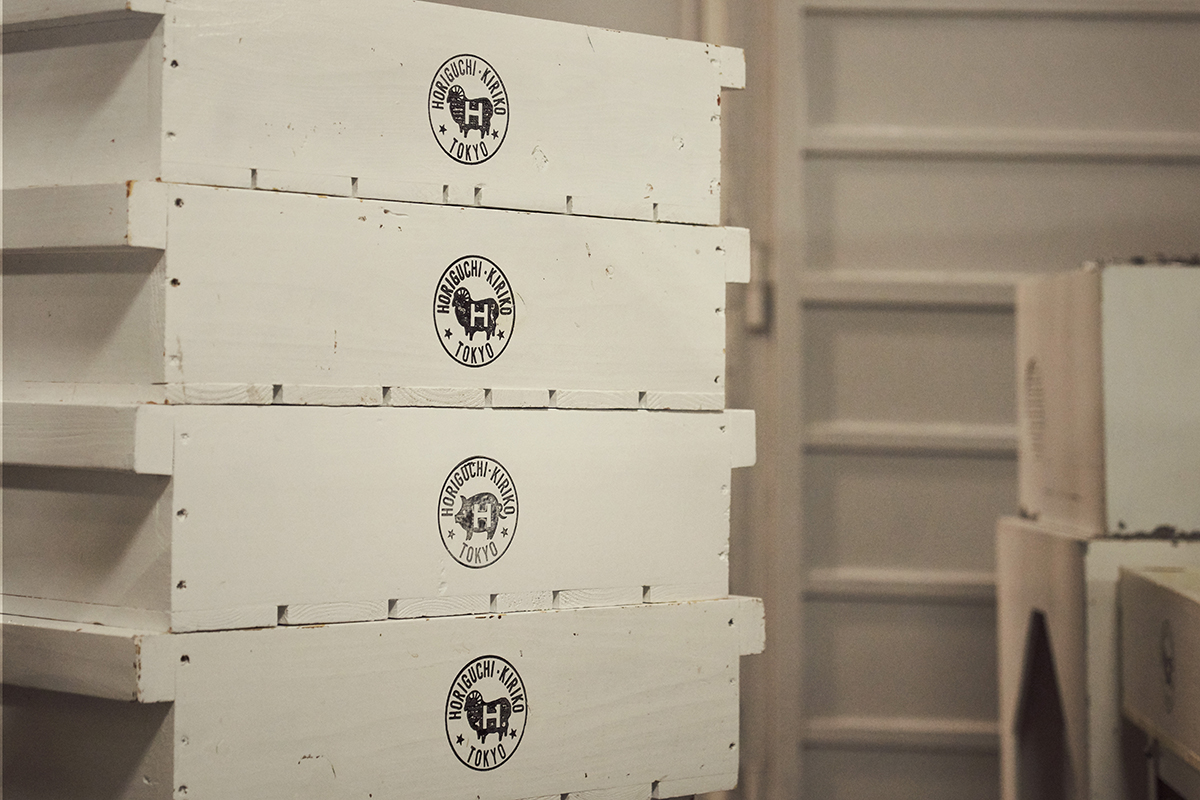
堀口切子で使用している、羊のシルエットが印象的なこのロゴは、堀口硝子から踏襲したものです。
初代秀石は、ブランディングに対する先見性に大変優れていました。「秀石」という称号に加え、昭和三十年代の当時としては珍しく、ロゴを用いることを決めたのでした。しかし、江戸切子を製作する会社のロゴに、なぜ羊のシルエットが用いられたのか。ガラスや江戸切子とは関連性のないものであるため、「なぜ羊なのか。」と問われることも少なくありません。
「江戸切子でのし上がり、成功する。」
そんな気概に満ちていた初代秀石は、山羊と同様に、紙を食べるとされる羊に目をつけます。そして、「紙を食べる=お金を食べる」と発想を膨らませました。次々にお金を食べるような、貪欲に成功を追い求める、羊のような会社でありたい。そんな強い思いから、堀口硝子のロゴが生まれたと言われています。その後、幾度か小さな変更が加えられることはありましたが、羊が姿を消すことはありませんでした。堀口切子では、初代秀石が羊に込めた思いを受け継ぎ、このロゴを今でも大切に使用しています。
Horiguchi Kiriko’s cooperate logo with an impressive silhouette of a sheep, has been inherited from Horiguchi glass.Shūseki (I), Ichio Horiguchi had an outstanding foresight in branding. His decision to adopt the title “Shūseki”, and to give the company an original logo was extraordinary for the time (1950s).
However, why was a silhouette of a sheep selected to be on the logo of a company that produces Edo Kiriko? We are often asked for the context of this decision.
“We will succeed and rise in the Edo Kiriko business.”
In the early 1950s, as Japan was showing indications of rapid economical growth, Ichio was full of passion for his business. This was when goats and sheep gave him an inspiration. In Japan, goats and sheep have long been recognized to eat paper.This inspiration then expanded into “eats paper = eats money”.He was determined to build a business that is always hungry for success, as if they were hungry sheep that will eat money one after another.The Horiguchi glass logo was a product of Ichio’s strong determination for success.The logo has undergone a few modifications through time, but the sheep remained.At Horiguchi Kriko, we follow in Ichio’s footsteps, and take over his passion that has been infused into the logo.